
SHM Studio illustrates the 7 fundamental tips for creating effective corporate brochures, transforming a "traditional" tool into a powerful marketing resource capable of distinguishing the brand and converting customers.
- Tangibility and Distinction: In a saturated digital world, the brochure (print or digital) offers a unique tactile and visual experience, representing an premium business card that imparts authority and personality to the business.
- Target and Tone of Voice: Knowing the audience is crucial; the language and style must adapt to the reader (technical and formal for professionals, creative and informal for young people), avoiding self-referentiality and focusing on real benefits for the customer (80/20 rule).
- Quality and Visual Consistency: The choice of fine paper, appropriate formats and impeccable printing is essential to convey professionalism. Furthermore, the graphics must strictly respect the brand identity (colors, fonts, style) to ensure coordinated communication with the website and social media.
- Clarity and Call-to-Action: Short and readable texts, high-resolution images, and a clean structure must guide the reader toward a clear Call-to-Action (CTA). Clearly visible contact information (perhaps with a QR code) is a must to facilitate immediate interaction.
The corporate brochure are still today one of the most used and appreciated "old school" advertising types. The importance of this offline marketing methodology is often underestimated but can contribute to enormously increasing a business's customer base. Whether in paper or electronic format, the brochure represents the mirror of the company in the world and, despite the years continuing to pass, the rules for its correct creation always remain the same.
In this article, we at SHM Studio we do not wish to provide you with a true practical guide, but instead we would like to give you some very useful advice on how it should be made, the content to be included and, at the same time, also the mistakes to absolutely avoid.
SHM Studio's tips for the perfect corporate brochure
Who you are, what you do, how you do it, and what the strengths of your business are. These are the main elements that must never be missing in a good corporate brochure.
Certainly, nowadays, online marketing and advertising are the most immediate and safe choice to make your business known. However, the brochure remains a plus, a way also to stand out from the crowd and give a more personal and direct touch to your business.
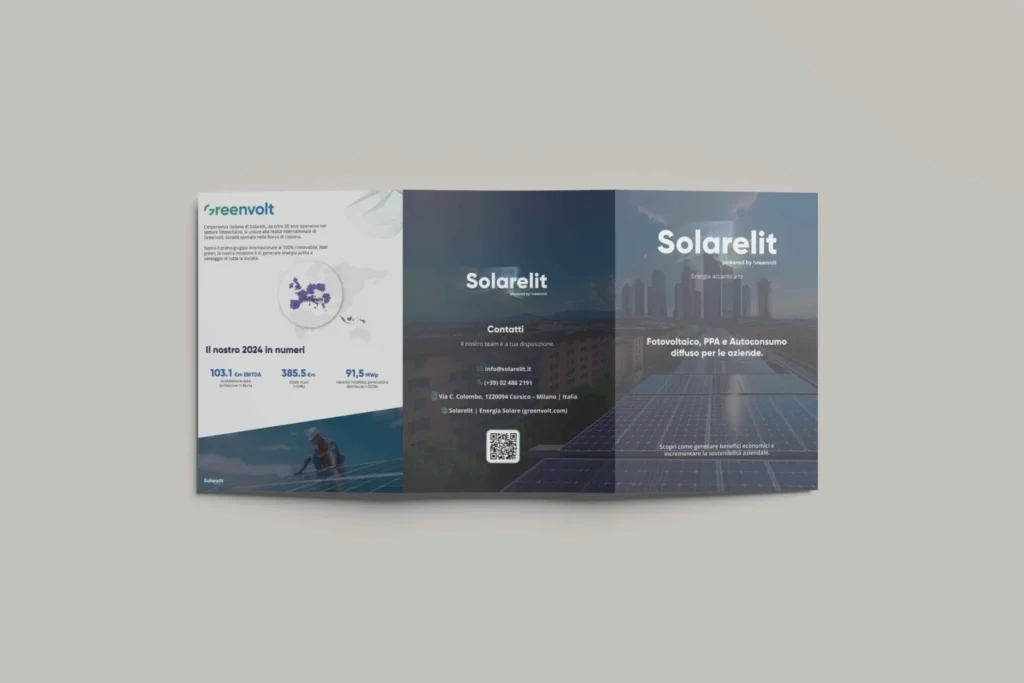
For this reason too, it is strongly discouraged to create it using normal programs like Word or PowerPoint, but it is instead necessary to turn to expert professionals in the sector, graphic design studios, web agencies and copywriters, services that we at SHM Studio we have been providing for some time. Let us now see how to create a good corporate brochure ,also using as an example a brochure that we have created for Solarelit , for which we are taking care of all the graphics part.
Who are we talking to? The analysis of your audience is fundamental
The main objective of a corporate brochure is to raise awareness of your company and stimulate a response from the public. A brochure that is too generic, however, will not help you in this regard and will not serve to convert customers. Consequently, it is important to know your target audience.
A brochure written for professionals will perhaps have a more serious and formal Tone of Voice and will focus on technical information and quality guarantees. If instead you try to reach the heart and mind of a young audience, you could focus on a more informal copywriting with creative ideas, which speaks more to feelings and emotions than to the head.
Self-referentiality is often counterproductive
This is great advice not only regarding the creation of a corporate brochure, but in sales in general. Writing that you have been the leading company in the sector for eighty years, that you are good and that you have more experience than others is not a guarantee to convert a customer.
Instead, the copy should focus on what you can do for the customer, what kind of problem you can solve for them, and what sets you apart from the competition. You can use a simple rule, namely the 80/20 principle, where 80% of the content should focus on the benefits for the customer and only 20% on the features of the product or service.
The choice of format and printing
There is no single answer regarding the best format to use for a corporate brochure. Much depends on how you intend to use it. For example, if you are talking about booklets to distribute at trade shows and events, a small format is ideal so that it is not too bulky. If, on the other hand, the brochure is designed to end up on a manager's desk, you can also dare to use larger formats, perhaps square with two folds.
Currently, the main formats for brochures are 10 x 21 cm, 11.50 x 16.50 cm and 14.85 x 21 cm, with two, three, four or more folds.
Tactile sensations are also fundamental, so do not skimp on paper and printing. A potential customer will be more inclined to read your booklet if it is printed on top-quality paper, perhaps with a sophisticated and eye-catching watermark. This may seem expensive, but the brochure is the company's primary calling card, and it must be crafted impeccably.
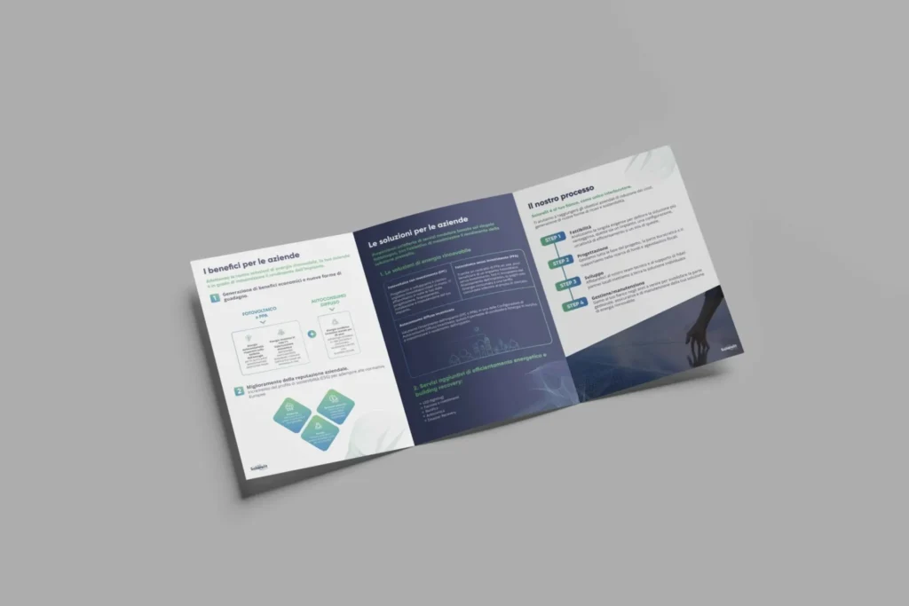
In the case of the brochure that SHM Studio has created for Solarelit, A three-panel format was chosen to ensure elegance, readability, and portability. The technical data is highlighted and easily accessible, which is perfect for capturing the reader's attention. The printing is also clear and sharp thanks to high-quality paper, with no grainy images or smudges that could put the company in a bad light.
The text in a corporate brochure
Given the limited space, it is advisable to avoid long, dense texts full of often useless information. Instead, the best approach is to use headings, subheadings, and bullet points that help make the content easily readable and smooth, ensuring a fast, sober, and clear read.
The claim must be clear and recognizable right from the start, with no room for error or misunderstanding. Furthermore, the language should reflect the company's way of communicating in order to make it easily recognizable to the public. Consistency, whether visual, graphic or textual, is one of the best solutions to make yourself memorable.
The brochure is part of your story, respect the brand identity
Corporate brochures are not a standalone product, but should be part of a communication line that embraces the entire business. Consequently, the customer brochure should follow the same rules and a similar type of communication compared to the website , to Social and to all previously used marketing channels.
What is told goes far beyond the concepts written on the brochure. It talks about your history and your brand identity . Space for creativity exists, especially when you are not advertising the company in general but a specific product, but all elements and aspects must be made harmonious both from a graphic standpoint and in communication.
In the case of Solarelit , we at SHM Studio we tried to respect the website's graphics as much as possible, keeping fonts, styles and primary colors very similar, in order to retrace the company's original identity.

Graphics in corporate brochures: images and fonts
Brochures are neither catalogs, nor even manuals. They are often only skimmed, and consequently having eye-catching, high-quality lettering and images makes the difference between a brochure that is thrown away and one that is read carefully, whether in print or electronic format.
The brochure must be nice to read and simple, also using white spaces and paragraph breaks. This is to give "breathing room" to the reader and not make the reading heavy and concentrated. The choice of font is very important, there are many types of them and designed for different purposes, from the strongest and most personalized to the more traditional and soft ones. In such a short document, it would be better not to use more than two, or it risks becoming confusing.
For images, whether they are stock purchased or original and specially created by professional designers , it is important that they are eye-catching and of the highest resolution: there is nothing worse than a brochure with grainy and blurred images. Furthermore, they must respect the layout of the brochure, both on a chromatic, artistic and conceptual level.
What cannot be missing in a corporate brochure: CTA and contacts
Whether it is an invitation to visit a website, contact the company, or make a purchase, the CTA (call-to-action) can never be missing. A company gains nothing from its brochure if the reader remains passive and merely absorbs the message. Instead, you need to convince the customer to take the next step, urging them to interact with the company and request more information.
For this reason, it is also essential to include clear, complete contact information that is easily accessible to the customer. Address, phone number, email address, and social media links. This data must always be present, preferably on the back cover, so that it is seen by the reader. This enormously increases the chances that the brochure will achieve its purpose.
The contacts, in the brochure we created for Solarelit , are clear, positioned on the back of the brochure and containing all important information, as well as a QR code that simplifies the interaction between the customer and the company.
A successful corporate brochure requires careful planning and precise execution. By following these seven rules, it is possible to create a document that not only presents the company accurately, but also stimulates interest and action from readers. For professional production, contact SHM Studio , and we will help you create the perfect brochure for your business needs.
Related articles
Discover more articles exploring similar topics, selected to offer you a more complete and stimulating perspective. Each piece of content is carefully chosen to enrich your experience.