
- Website graphics: techniques, tools and strategies for the best design
- The creation of the first graphic draft
- Building the website structure: the three elements that cannot be missing
- Responsive design: optimizing graphics for every device
- Website graphics: other elements that cannot be missing
- The advantages of personalized graphics
SHM Studio illustrates how web graphics are not just about aesthetics, but a strategic balance between functionality, usability, and visual identity, essential for converting visitors into customers and standing out from competitors.
- Methodical Approach: The process begins with the definition of company objectives and target expectations, then translates into graphic drafts that integrate creativity and functionality, continuously refined until the final layout.
- Essential Structure: An effective site is based on three pillars: Header (logo and intuitive navigation), Footer (contacts, social, and legal information), and Contact Form (to encourage direct interaction and lead generation).
- Responsive and Mobile-First: Adaptability to all devices is essential; the "mobile-first" approach ensures that the user experience is fluid and optimized even on the smallest screens, without sacrificing content.
- Key Graphic Elements: Logo, cohesive color palette, high-quality images (optimized for speed), and readable fonts are the ingredients that, when well-orchestrated, improve usability and strengthen brand identity.
In this increasingly digital age, the graphics for websites has become a crucial aspect. Having an online presence through a web platform is now essential for every type of business, but the visual impact can make all the difference. In fact, it is no longer enough to simply be present online; the design of your site is fundamental to capturing users' interest and converting visitors into customers.
The graphics of a website it's not just "aesthetics": it constitutes a sophisticated balance between functionality, usability, and appearance, factors that together determine the site's effectiveness in generating traffic and stimulating conversions. It also allows you to stand out from competitors, establishing a distinctive image for the brand.
In this article, we will explore the procedures to follow to maximize the visual appeal of your platform, ensuring it is both aesthetically engaging and technically performant.
Website graphics: techniques, tools and strategies for the best design
The first step in developing the graphics for a website consists of defining business goals: it is essential to understand what the company intends to communicate to its users and how it wants to do so. Naturally, the visual identity must be a reflection of the brand. It is therefore essential to ask the question: what does the user expect to discover when visiting my website?
First of all, it is important to identify the specific expectations and needs of your target audience. Once the goals are clear and the audience's expectations are well understood, you can start working on the preliminary design of the graphic part, meaning the layout of the web pages.
The creation of the first graphic draft
We have already emphasized how fundamental the visual impression is to establish oneself online.
For this reason, at SHM Studio, we follow a methodical approach in designing the website graphics for our clients.
It all begins with the creation of a graphic draft that integrates creativity, functionality, and aesthetics: all key elements defined in the initial phases of the project. Next, we process a worksheet to trace the layout, carefully examining its strengths and weaknesses.
Design is a dynamic process that requires continuous refinement until the final layout is achieved, perfectly aligned with the brand identity. The use of specialized graphic design software is often crucial for refining and optimizing the final results. We will discuss this further later.
Building the website structure: the three elements that cannot be missing
A website, showcase or Ecommerce , it must adhere to a clearly defined structure, which includes three essential elements for its functionality and effective visual communication.
Here are they:
Header
the top part of the page is crucial for establishing a positive first impression. It contains your brand's or business's logo, a symbol of the company's visual identity. Furthermore, the header includes the main menu, essential for smooth and intuitive navigation through the different sections of the site, which enhances the user experience.
Footer
positioned at the end of each page, the footer is a strategic section for offering supplementary information to users. It is the perfect place to insert company contact details, links to social media pages, and legal information such as privacy terms , elements that reinforce transparency and user trust. This also contributes to overall visual consistency, an essential aspect in website design.
Contact form
Essential for any website, the contact form allows users to communicate directly with the company. This tool is vital for encouraging audience interaction and engagement, offering a direct way for users to request information, ask questions, or get support. The ease of access and use of this form is very important for maintaining effective communication and not losing potential contacts.
Responsive design: optimizing graphics for every device
A modern website must indispensably offer graphics that adapt to different types of devices.
It is essential that content is accessible in an optimal way on both computers and smartphones and tablets. This concept is known as "responsive design", and implies that the web page layout automatically modifies to adapt perfectly to various devices.
Responsive design offers numerous advantages, including:
- Optimal display of the site on various devices;
- Smooth navigation even on smaller screens, such as those of smartphones;
- Ability to increase the size of texts and images to facilitate reading.
However, it is important to adopt the mobile-first approach when designing web pages.
This means that the design begins with the interface optimized for smartphones, and is then adapted for larger screens such as those of desktops.
Furthermore, when adapting content to different interfaces, it must never be cut or deleted, but rather properly resized or modified to meet the specific needs of the display.
Website graphics: other elements that cannot be missing
When you create a website, there are specific graphic elements that are essential to enhance your platform and ensure an optimal user experience.
Logo
This is the distinctive element of any website, visually representing your brand. The logo it must be distinctive, reflect your company message, and remain etched in users' memory, immediately associating it with your business.
Colors
There are no fixed rules for color usage, but it is wise to establish a palette that includes primary and secondary tones to maintain visual consistency and harmony throughout the site. The chosen colors should also be consistent with those of the logo, which will appear on your company's various social media channels. For example, green or white are popular choices for healthcare websites, blue for technology ones, and orange for food-related sites.
Images
Images capture attention more quickly than text and must be of high quality and resolution to avoid distractions or discomfort among users. It is essential, however, that they are optimized so as not to negatively affect website performance. The use of tools like GTmetrix can facilitate the verification of site performance and the analysis of the impact of images on loading speed. The use of suitable file formats, such as SVG for vector images and JPEG or PNG for photographs, is recommended. It is also important to minimize file sizes while maintaining image quality. Whether you opt for personal photographs, images acquired online, or custom-created graphics, ensure they are relevant and effectively communicate your message clearly and directly.
Font
Font selection should reflect your brand's personality and the message you want to convey. It is advisable to use highly legible fonts and appropriate text sizes to ensure visitors can read the content without difficulty. It is recommended to set the base text size to no less than 18px, and to limit the font choice to two main variants: one for headings and one for running text. Use different font weights to create a visual hierarchy, if necessary. Also consider the impact of backgrounds: favor neutral backgrounds and reserve darker or brighter colors for special informational areas, such as highlight boxes or calls to action.
Integrating all these elements correctly not only improves the aesthetics of your site but contributes significantly to usability, ensuring your platform is as engaging as it is functional.
The advantages of personalized graphics
When talking about graphics for websites, one must consider the possibility of developing graphics from scratch or using some of the numerous standard templates available online. Platforms like offer a wide range of pre-set themes, many of which are free, that can serve as a starting point.
However, even if you use one of these templates, you will need to make changes to adapt it to your needs, customizing elements such as colors, fonts, and layout to reflect your brand.
Modifying a template can vary in difficulty: some are easy to customize, while others can be more complex. It is important to evaluate whether adapting a standard template meets your expectations or if it would be more productive to develop a custom template that better represents your business and integrates the specific functionalities you desire.
If you choose to create a completely original design, you can use professional tools such as the following:
Sketch
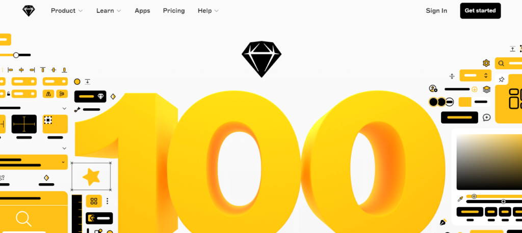
Sketch it is a graphic design tool highly appreciated by web design professionals, especially for creating user interfaces and prototypes. This software is exclusively available for macOS and stands out for its intuitive interface and features specifically designed for digital design. Sketch allows designers to develop visual layouts, create interactive prototypes, and easily collaborate with other team members. It offers a wide range of plugins and integrations that can further extend its capabilities, making it a flexible and powerful tool for digital design.
Figma
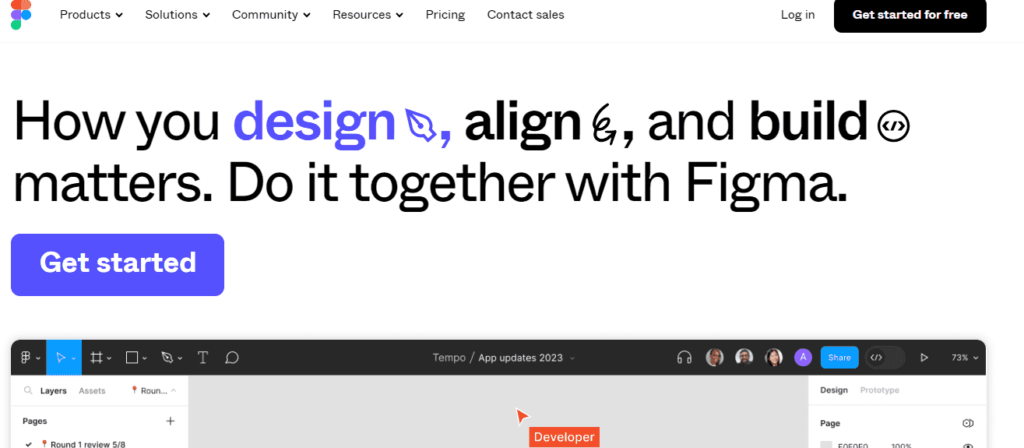
Figma it is a cloud-based collaborative design tool that has quickly established itself as a favorite in the web design industry. With Figma, designers can create, collaborate, and prototype design projects in real time, allowing multiple people to work on the same project simultaneously. It is known for its ease of use, intuitive interface, and powerful graphic features, which include tools for layout creation, vector editing, and style management. Figma also offers a wide range of plugins and integrations that allow designers to extend its capabilities according to their specific needs.
UXPin

UXPin it is a design platform that focuses on user experience (UX) and user interface (UI), offering users a comprehensive tool for designing websites and applications. With UXPin, designers can create wireframes, interactive prototypes, and pixel-perfect designs, all within a single platform. Easy to use and featuring a fast interface, this tool allows designers to focus on creating high-quality user experiences quickly and smoothly. Additionally, UXPin offers advanced collaboration features that allow team members to work together in real-time, facilitating communication and the sharing of ideas.
Creating a website represents a challenge that can vary significantly in terms of complexity, influenced by personal skills and available resources.
If you have no experience in graphic design or programming, it could prove extremely beneficial to rely on a specialized agency. In this context, SHM Studio, Milan web agency , can be your trusted partner, offering a wide range of services that also includes graphic creation for websites.
Website design is an often underestimated aspect, and in our work, we often encounter online platforms with outdated, unattractive, and non-responsive graphics. These flaws not only compromise the aesthetics of a site but also negatively impact the user experience, making navigation frustrating and less intuitive, especially on mobile devices.
Our team pays particular attention to the modernity and effectiveness of graphic solutions, ensuring that each site is not only visually appealing but also fully adapted and functional on desktops, smartphones, and tablets. SHM Studio's collaborators, expert programmers and web designers, work in close collaboration with clients to develop customized solutions that perfectly meet specific needs.
For a free initial consultation, do not hesitate to contact us .
Related articles
Discover more articles exploring similar topics, selected to offer you a more complete and stimulating perspective. Each piece of content is carefully chosen to enrich your experience.